Flowit Supply
Date
2026
Location
Dallas, TX
Services
Brand Identity
Print Design
Art Direction
The Brief
Overview
This was our own studio’s rebrand — a chance to turn the same care we bring to client work inward. We refined our name, mark, and printed materials into something we’d actually be proud to hand across a table.
The Challenge
Our old identity had grown generic over the years, stitched together from whatever felt fastest at the time. Business cards, decks, and the site all looked like they belonged to three different studios.
Solution
We built a tight grid system, a single confident wordmark, and a small set of embossed printed pieces, then applied that same system across every touchpoint so the studio finally looks as considered as its work.
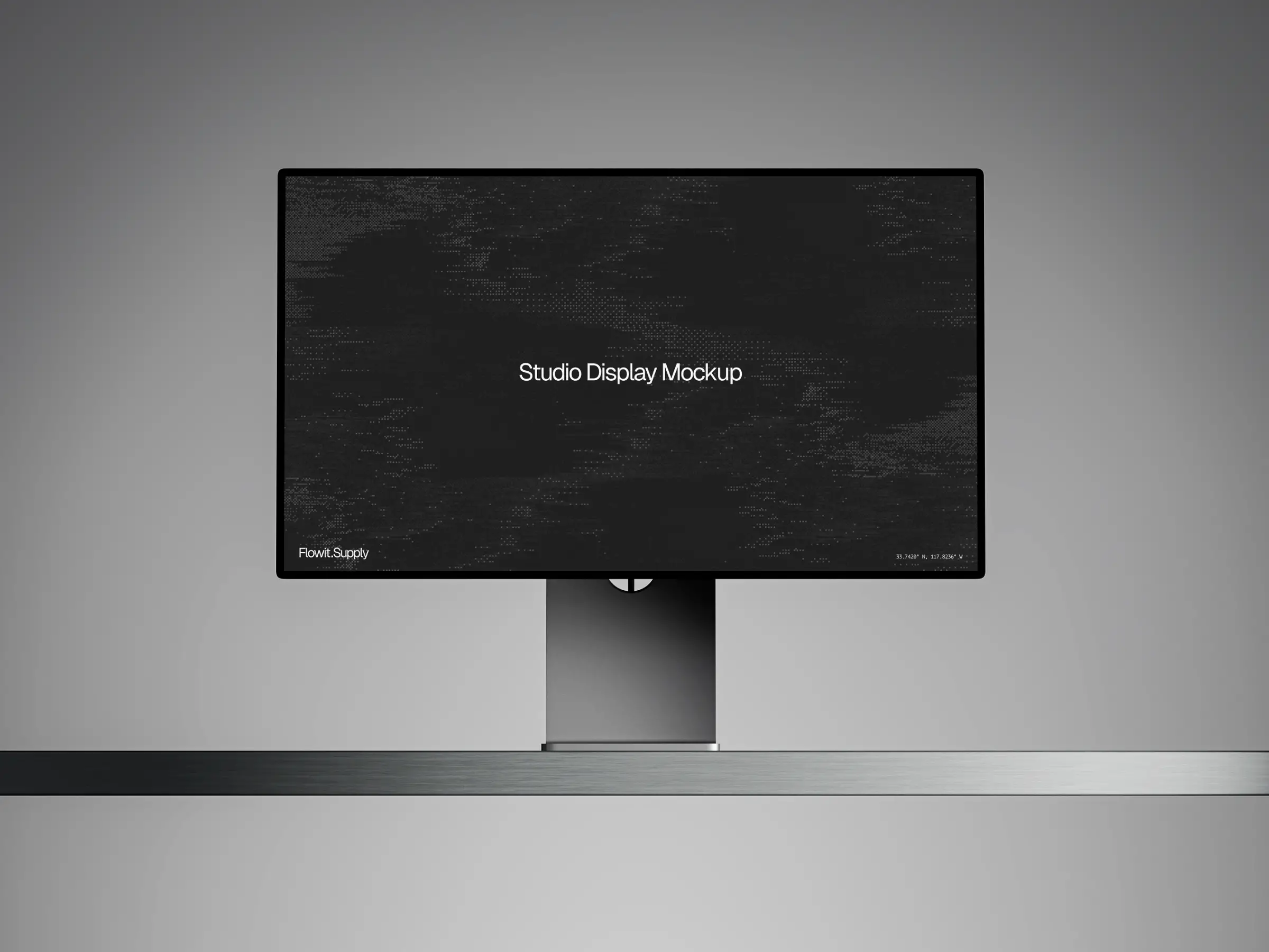
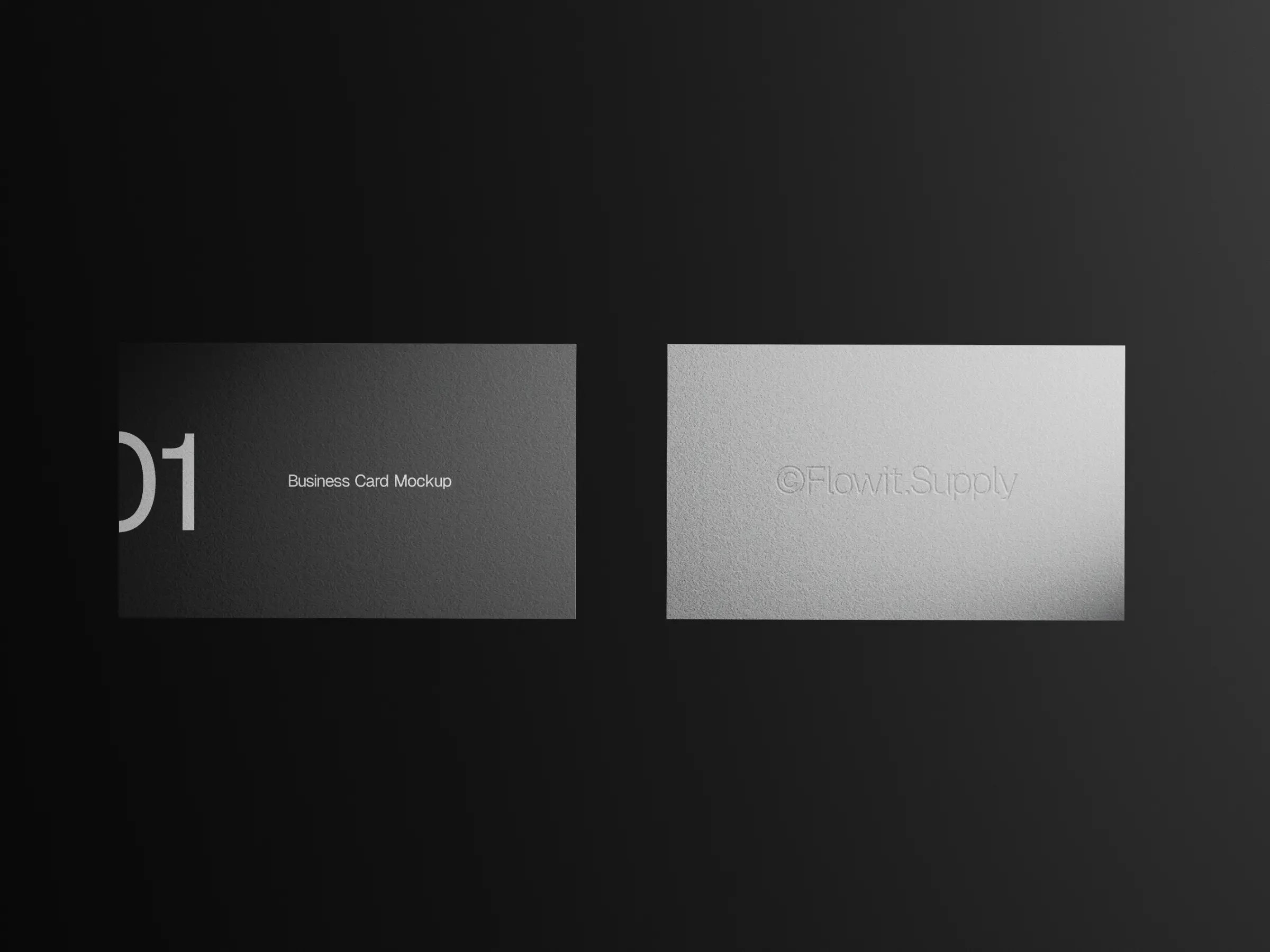
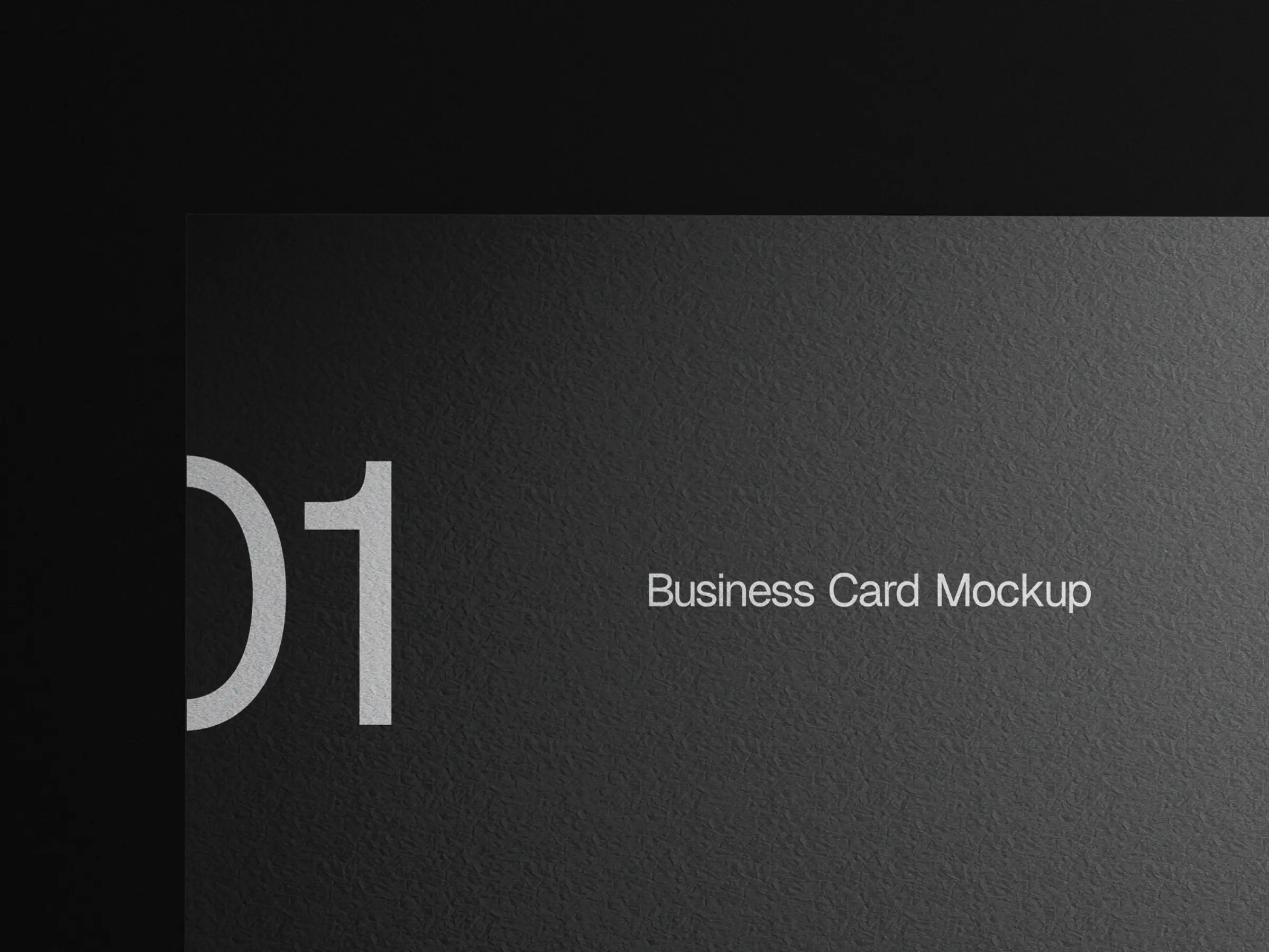
Embossed Cards
A blind emboss on uncoated stock keeps the mark subtle in hand, favoring texture over ink so the card feels closer to a printed object than a marketing handout.
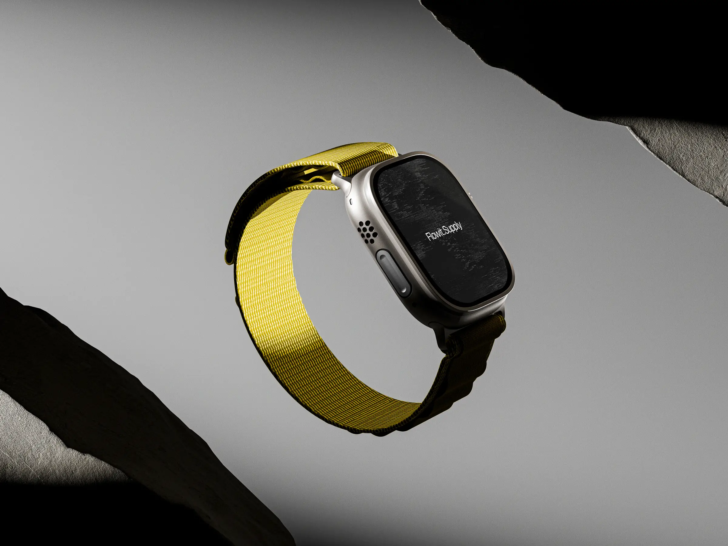

One Consistent System
The same grid, type scale, and mark now carry across cards, deck, and site, so no touchpoint feels like an afterthought bolted onto the rest of the studio’s work.
Results
The Challenge
Our old identity had grown generic over the years, stitched together from whatever felt fastest at the time. Business cards, decks, and the site all looked like they belonged to three different studios.
Solution
We built a tight grid system, a single confident wordmark, and a small set of embossed printed pieces, then applied that same system across every touchpoint so the studio finally looks as considered as its work.

