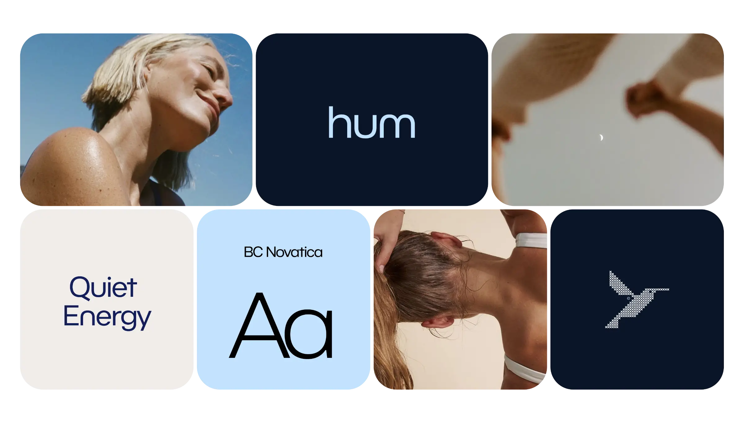
Hum
Date
2025
Location
Austin, TX
Services
Packaging Design
Brand Identity
Art Direction
The Brief
Overview
Hum needed a shelf presence for a drink built around calm, sustained energy rather than a jolt. We designed a can and identity system quiet enough to stand apart in an aisle full of neon, loud claims, and cartoon mascots.
The Challenge
The energy drink category is visually deafening — bright colors, aggressive type, and shouted claims on every can. A calmer product risked disappearing entirely if it played by the category’s existing visual rules.
Solution
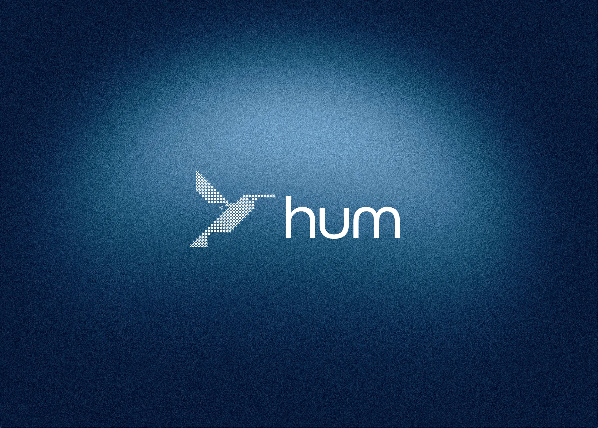
We chose a matte navy palette, a single small hummingbird mark, and a wordmark with room to breathe, then carried that restraint through every flavor variant so the whole line reads as one confident, quiet family.
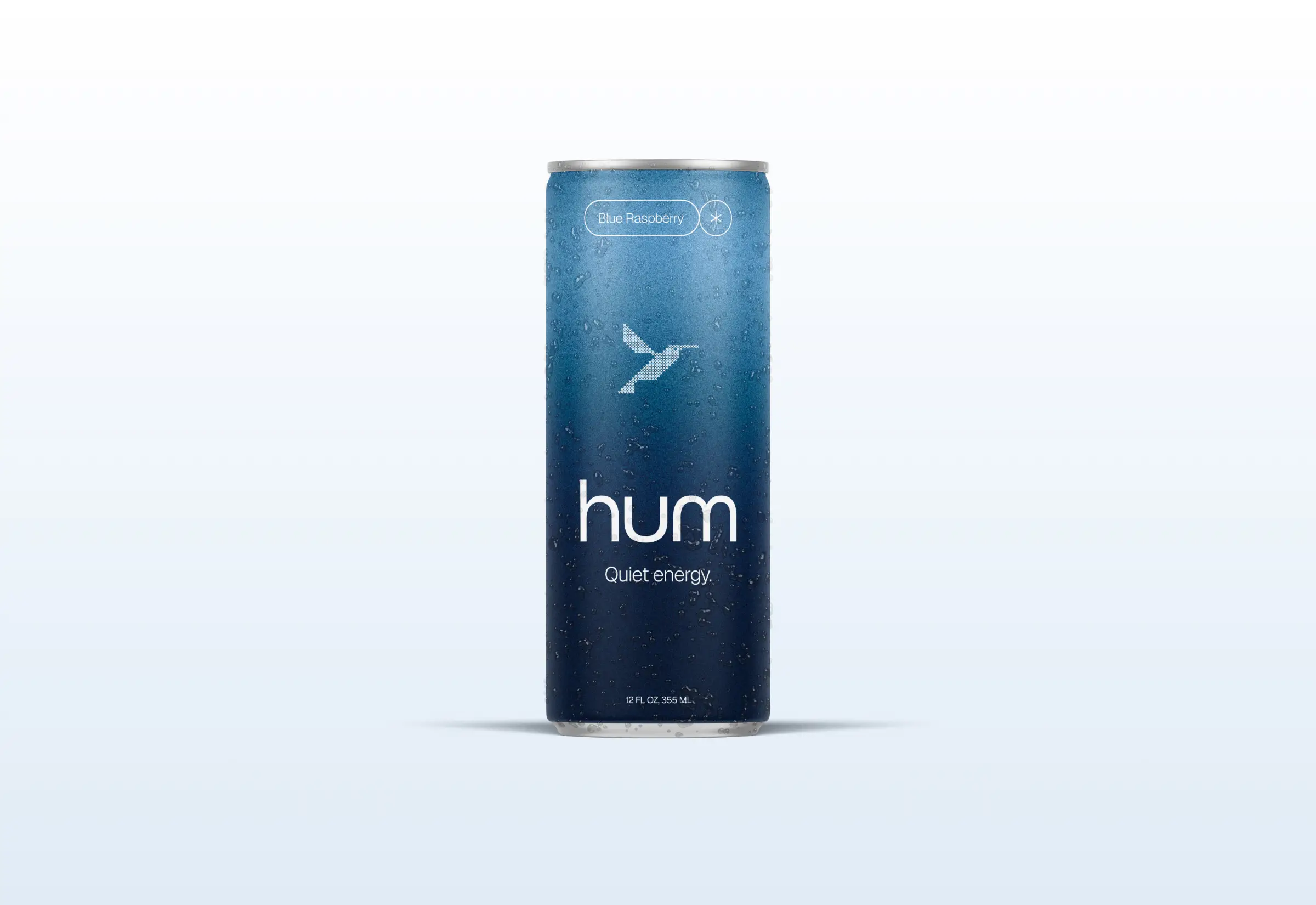
Matte Can Finish
A soft-touch matte coating and tonal gradient give the can a tactile, premium feel in hand, setting it apart from the glossy, high-contrast cans that dominate the cooler.

Flavor System
Each flavor keeps the same navy base and mark, shifting only a small accent color and label copy, so the shelf reads as one coherent brand rather than a scattered lineup.


Results
The Challenge
The energy drink category is visually deafening — bright colors, aggressive type, and shouted claims on every can. A calmer product risked disappearing entirely if it played by the category’s existing visual rules.
Solution
We chose a matte navy palette, a single small hummingbird mark, and a wordmark with room to breathe, then carried that restraint through every flavor variant so the whole line reads as one confident, quiet family.